Gelson’s Market Private Label Brand
Gelson’s Market is a premium food retailer with locations throughout Southern California and a long-standing reputation as a pioneer for high-end palates. The private label portfolio needed an identity that could stand confidently on shelf, feel unified across categories, and still read unmistakably as Gelson’s—distinct enough to be a brand in its own right, but clearly connected to the parent.
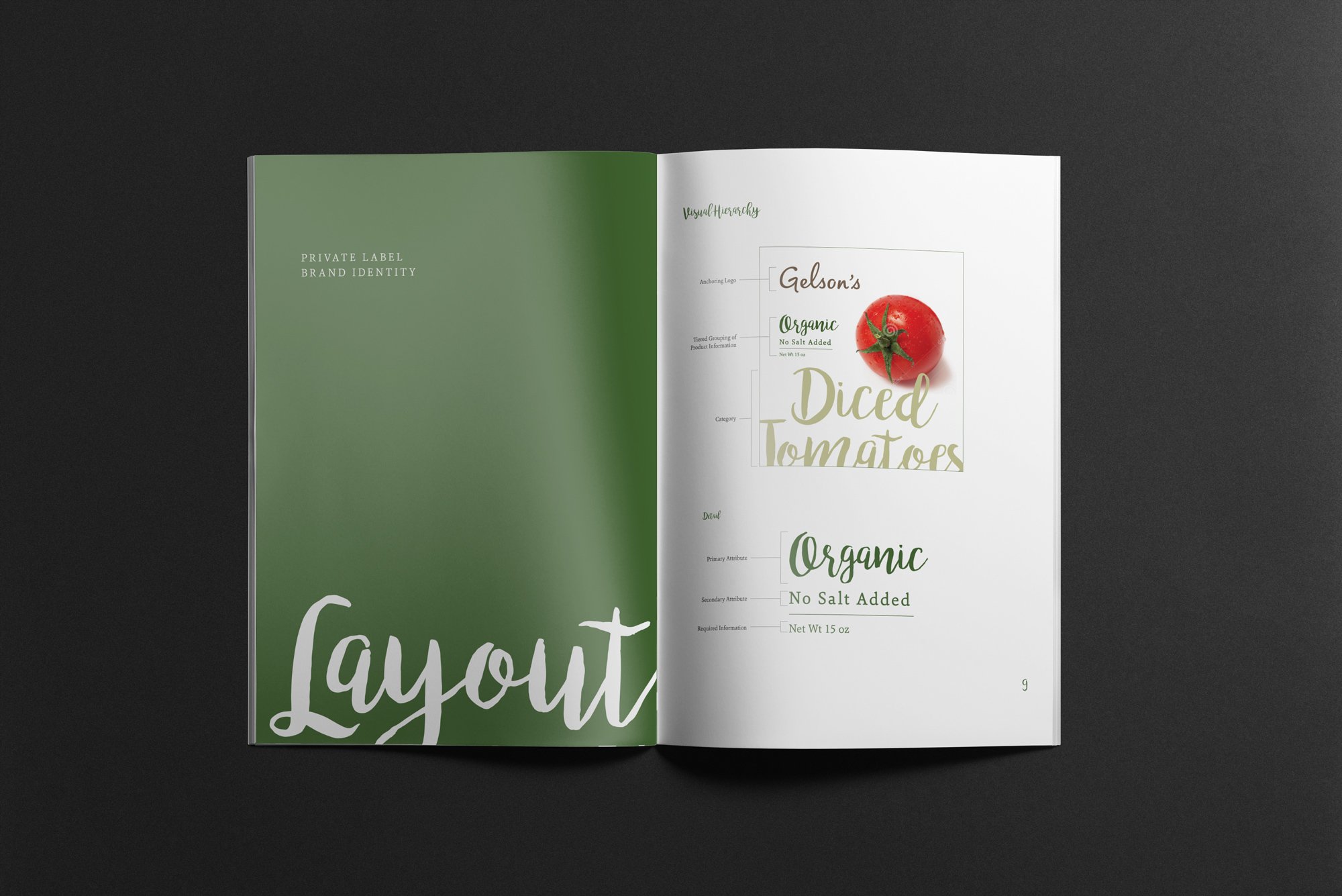
While at Shook Kelley, we developed the core building blocks of the Gelson’s private label brand identity. The “kit of parts” included a calibrated color palette, brand elements, typography system, and photography direction designed to work together across a wide range of products. The intent was to create a professional, consistent, and harmonious image that could scale as new items were introduced, giving Gelson’s a clearer, more premium presence in the private label space.
By codifying these elements into a cohesive system, the private label line gained a stronger, more recognizable shelf story—supporting shopper confidence, reinforcing the master brand’s promise of quality, and making it easier for internal teams and partners to extend the line without diluting its character.
Client: Gelson’s Market
Role: Packaging Design, Art Direction
Firm: Shook Kelley
Team Lead: Sabrina Fan
Strategy: Jennifer Kim, Michael Powell