
Outlaw Rolls
Developed in partnership with Shook Kelley, Outlaw Rolls is a fast casual sushi concept that reimagines sushi through a distinctly American lens—equal parts frontier attitude and comfort-food familiarity. The menu leads with bold, unexpected rolls like the Southern Fried Chicken Roll, Texas Brisket Roll, and Louisiana Po’ Boy Roll, inviting guests who might not see themselves in traditional sushi culture into a more approachable, playful experience.
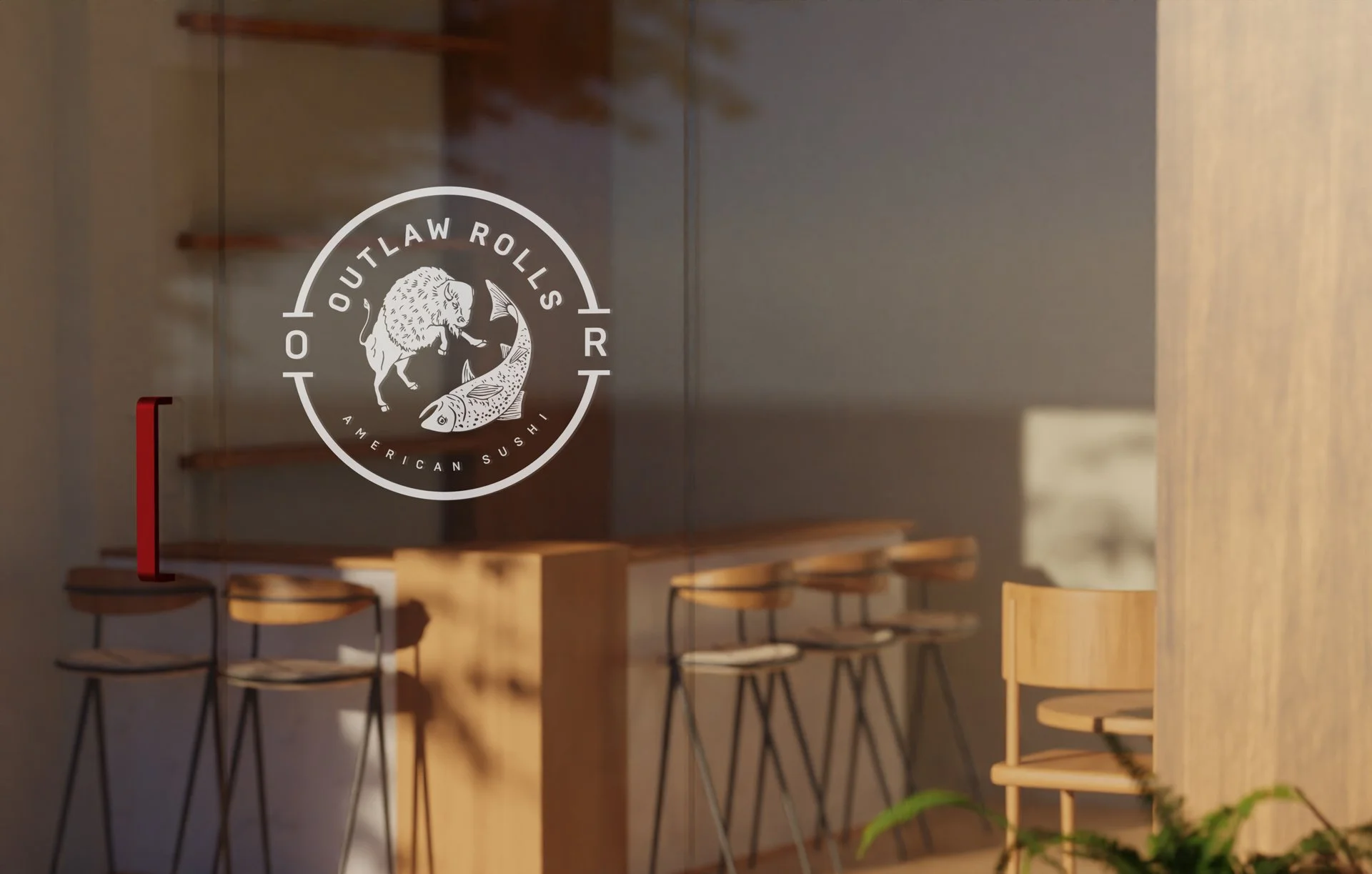
The brand identity was designed to make that premise unmistakable. Rather than lightly referencing fusion, the mark figuratively “stomps” on convention: a traditional seal depicting a bison overpowering an upside-down fish becomes the core symbol of the brand. Together with typography, color, and supporting elements, the logo declares Outlaw Rolls as the “Home of American Sushi,” signaling a clear break from convention while still feeling grounded and iconic.
Across applications, the identity system reinforces this narrative—pairing frontier-inspired symbolism and language with contemporary restaurant design cues to create a cohesive, highly ownable platform for future locations and campaigns. The result is a concept that feels familiar enough to be welcoming, but distinctive enough to stand apart in a crowded fast casual landscape.
Client: Harris Hospitality
Role: Branding, Identity, Art Direction
Firm: Shook Kelley
Team Lead: Sabrina Fan
Strategy: Jennifer Kim and Michael Powell


